USER GUIDE
How to get started
There are three main sections:
- Explore
> Quickly explore a specific address or area. Here you will find information about people flow, businesses and amenities, and the local population. - Finder
> Find the best areas to operate your business by combining and ranking the importance of the criteria listed above. - Survey
> Identify the best spots in a network, using those same criteria AND your own data (revenue, POS, etc.)
Symaps recommends the “Light” option.
1 - Explore
Use the search bar to locate the specific area you would like to analyse, if you have one in mind. This area can be an entire country, a specific street, or anything in between.
If you have not yet decided on an area, you can drop the pin anywhere on the map to access the information for that place.
Once an address has been chosen, a pane will automatically open on the right side of your screen. The address will appear at the top followed by a picture of the street from Google Maps.
Two types of information will then be displayed:
- People Flow Analysis (number of people, and when they pass by the address).
- Here you can change the perimeter of the area that you would like to analyse (shown by the small black circle). The default value is 50m.
- The profile of passers-by (walking, driving, or both).
Warning: if the number of people passing by is too small, the traffic patterns will not appear.
Area Analysis (Business & Amenities): Analyse the area you have selected.
The tool will display a breakdown of all the amenities in the area.
The blue line on the map to the left shows how long it will take to reach your chosen location. You can change this range in terms of both time taken to reach the location, and the transport method (on foot, by bicycle or by car).
Once you have an initial idea about the specific location, you can use then use the left menu in the explore section.
First, choose the criteria you want to start with: People flow, Business and amenities or Population.
People flow
- Always pick “Footfall by time of day” in footfall type.
- Then, choose the time range. This part lets you pick the time range(s) you want to focus your analysis on. You can also analyse different time ranges simultaneously. For example, a restaurant might want to analyse passers-by during both lunch and dinner hours.
- Under the “Profile” section, you can choose from people walking by, driving by, or both.
- Choose the number of best areas (max 99) that you would like to view.
- The “Heatmap preview” is purely aesthetic. By default it is 3D Grid, but flat grid is also available.
- To tilt the map, hold down the “alt” key on your keyboard, hold left click anywhere on the map and drag in one direction. [afficher gif].
- To revert the map to its original position, simply press alt + R.
Business & amenities
Here, you can display any kind of amenities, be it a specific brand, like Starbucks or McDonald’s, or a general type of amenity, such as a café or a hospital.
You can both compare and combine your chosen amenities on the map at the same time. When comparing, you can colour-code your amenities for easier analysis.
Population
Based on the census of the relevant country, you can choose any available dimension. As these censuses are governmental surveys, dimensions are different from one country to another.
NEW
Compare
With this fonctionnality, you can now easily compare two places in terms of People flow and Amenities.
2 - Finder
The finder allows you to combine all the information from the People flow, Business and amenities, and Population sections into one analysis which can be saved, should you want to come back to it.
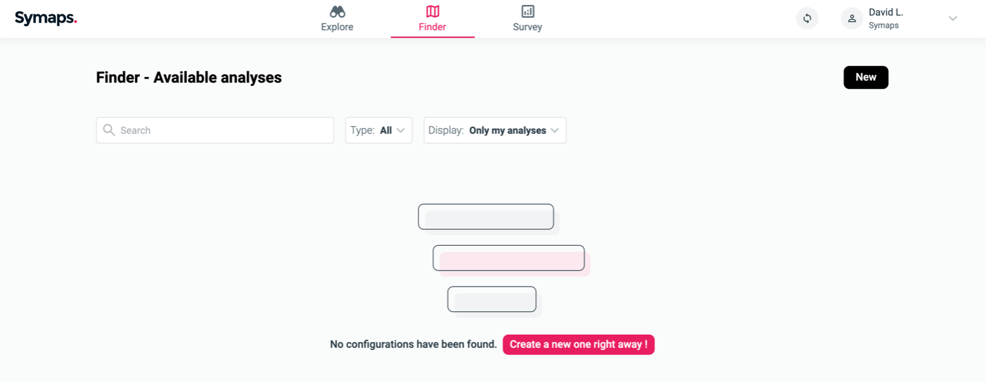
By default, this is the interface you’ll see the first time you login:

The first step is to create your own configuration.
Having clicked on “New”or “Create a new configuration”, you have two options:
- “Find the best area” to display a ranking of the best places to open a new shop, in an area of your choosing.
- “Identify the best spots in a network” to access a list of the best addresses from which to sell your products, in an area of your choosing.
Find the best area
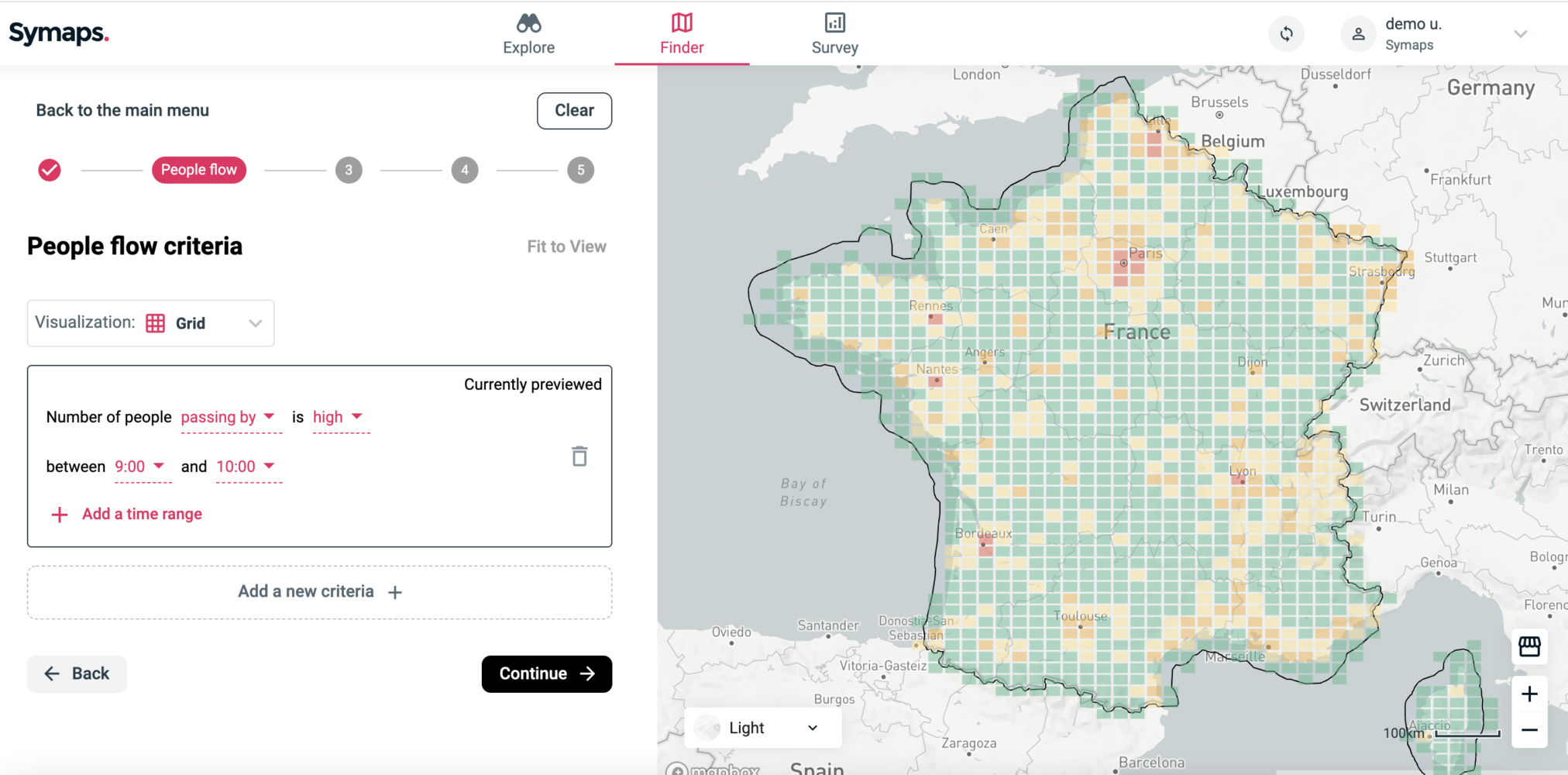
To create the ranking, you will need to go follow these 5 steps:
Area > People flow > Population > Business and amenities > Validation
Step 1: Area
- Choose a country
- Refine/adjust the search area if needed. Why? The smaller the area initially chosen, the more precise the insights will be.
- If you move away from the part of the map you are analysing and want to go back to it, click on the “Fit” button.
Caution: the size the zone defined will impact data granularity. The smaller this zone is, the smaller the sub-zones will be. The smallest plot size you can have measures 1.2km x 609.4m.
The best way to use the tool is to start with a big area, identify the zone you want to focus on, and then create another analysis focused on that specific zone.
Step 2: People flow

This part comprises two variables. You can choose:
- Whether you want to focus on places where the number of people passing by is high or low.
- A specific time range.
Step 3: Population
Here, you can select the part of the population living nearby that you would like to include in the analysis.
Step 4: Amenities
Here, you can select the amenities that you would like to include in the analysis. You can choose to include either a large or a small quantity of a certain amenity.
For example, if you want to be far away from supermarkets, you would select ‘There should be few of supermarkets‘.
Step 5: All criteria & ranking
In this final step, you can:
- Adjust the importance of each criteria you used by giving a specific weight to them.
- Preview the results of your analysis.
Once you click “get ranking”, you’ll have access to the complete analysis.
Once the ranking loads, you’ll see a list of areas where you could, for example, open a shop or sell your product.
The ranking is based on the 3 categories of criteria you selected: People flow, Business & amenities, and Population.
By hovering over a specific zone, you’ll get the ranking detail for each criteria.